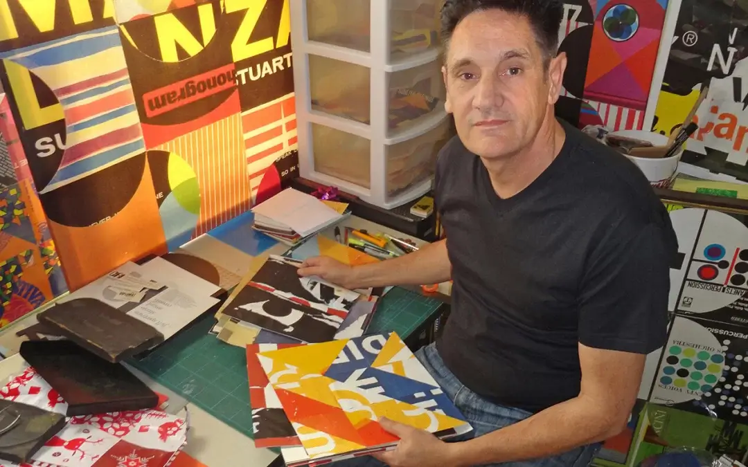
Checking-In: Graham Moore, Commercial Artist


This is the first in a series of profiles about people who live and work in the SoCal area. We tap into the vast range of professions and endeavor to explore method and outcomes. We start with Graham Moore, a graphic artist born in Somerset, England, living in Los Angeles. HIs work is swinging 60’s London and Retro Americana.
HOW IT BEGAN
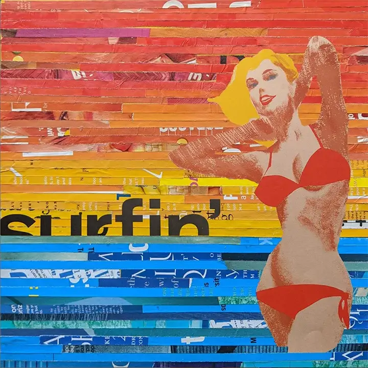
My journey started at Wimbledon school of art in London where I did my foundation studies, 3 years later graduated in Graphic Design. First job was working in a print shop in covent garden. Came over to New York in 1987, then down to Dallas, worked in a couple of design studios, them moved out to Los Angeles in 1991. Have continuously been working in the entertainment/music business/design studios/advertising agency as a graphic designer/Art Director. Was offered to teach a class at Art Center College of Design in 2003 and have been teaching as an adjunct faculty since then also at FIDM and currently at Woodbury University in Burbank. My own art started to take off in 2012, employing non-digital techniques, collage & mixed media being my process of choice. Out of many, Pop art would be my favorite art movement and that comes across in my work and most of the artists, music, fashion and style I admire are from that time period, the 1960’s. I continue to mix analog/digital techniques in both my personal and graphic design work!
What are the challenges in your profession?
It is not an easy road to tread….being a freelance designer/designer/teacher I am constantly hustling for work, looking for new clients, as an artist, be prepared for rejection, because it will happen, but not to be taken personally! Just remember that art is subjective so what one person may love, another person is not impressed! One door closes, another opens, that has been my experience! As a freelancer network, network & more networking for the next gig!
Can you explain your design thinking?
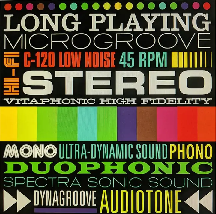
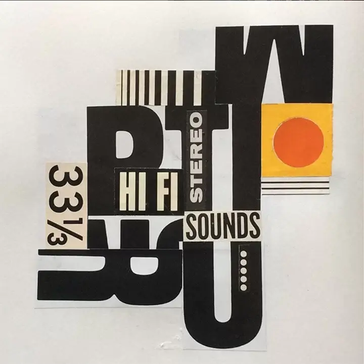
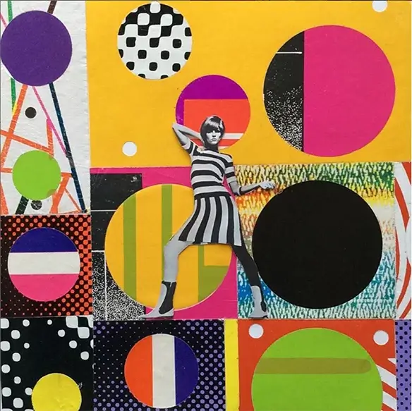
I love the clean, simple lines of mid-century modern design and the cool sounds of west coast jazz! and Blue Note jazz covers and the Abstract Classicists. I am a huge fan of the art movement, Califonia Hard-Edge. Bold lines, organic shapes, color and texture are all important ingredients that I employ in my own work. I was doing a lot of collage in my classes (art & design at Art Center and Woodbury University), always experimenting and exploring with different materials, textured papers and found imagery, etc. I had the idea to use record covers and the paper sleeves that protected 45 singles, specifically packaging from 1960’s. There is so much of it, an endless supply of material!
It already contained such strong use of shape, line, color and texture, (all the things by the way that I teach in my Basic elements and principles of design classes). There is something about the quality and feel of the printing from back then that cannot be rivalved! It seems ironic to me that it was the love of album cover art that made me want to pursue a career in graphic design in the first place, and here I am using it in a way I would never have dreamed of! Also, by accident, one day while working on my computer, from my living room window I was watching the clear channel guy strip down and replace some billboards. I went down and asked him what he did with the remnants and he said they just trashed it, so help yourself and through some experimentation found that there was a lot of great color, typography and texture to be had, and nice big areas of halftone dots!
My process is lots of experimentation! For instance, with the billboard pieces, I brake it down into manageable size pieces then soak it in the bathtub until I can peel it apart. The fun is always in the reveal because there are so many layers you never know what you are going to get! The record cover pieces are like a jigsaw puzzle, sometimes a piece will sit on my table for a few days, constantly moving pieces around until it feels right! There have also been instances where I have found the frame/frames first and created the piece specifically for the frame. One important factor is that I always use a square format, which relates to back to the album cover, be it 12 inch, 10 inch, 7 inch.
Photo, right: Jim wojtowicz and mother&daughter participates in the first Collage Garage workshop at the 1st annual recycled art fair @crafted at the port of Los Angeles in San Pedro California. https://express.adobe.com/
For more Moore: http://www.gmoorecreative.com/